AI based Graph Generation
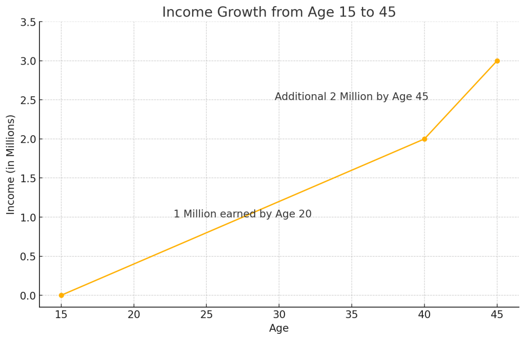
Here is the updated graph showing income growth from age 15 to 45. It reflects 1 million earned by age 20 and an additional 2 million earned by age 45, totaling 3 million. Let me know if you'd like to modify or explore this further!
# Reversing the timeline for a person who is currently 45 years old
                # The income growth will now start from age 15 (30 years ago) to age 45 (present).

                ages = [15, 40, 45]  # Age points from 15 to 45 years old
                income_full_reversed = [0, 2, 3]  # Same income data but with reversed time scale

                # Plotting the graph with reversed timeline
                plt.figure(figsize=(10, 6))
                plt.plot(ages, income_full_reversed, marker='o')

                # Adding titles and labels
                plt.title('Income Growth from Age 15 to 45')
                plt.xlabel('Age')
                plt.ylabel('Income (in Millions)')

                # Mark the phases
                plt.text(27.5, 1.0, '1 Million earned by Age 20', horizontalalignment='center', fontsize=12)
                plt.text(35, 2.5, 'Additional 2 Million by Age 45', horizontalalignment='center', fontsize=12)

                # Display the plot
                plt.grid(True)
                plt.xticks(np.arange(15, 50, step=5))
                plt.yticks(np.arange(0, 4, step=0.5))

                plt.show()
Imported from rifaterdemsahin.com · 2026